1.3 Describing Graphs, Charts, and Tables
(図表を説明する)

In the previous section, we learned characteristics of line graphs, pie charts, bar charts, and tables.
I know that’s a lot of information to intake. May, I know it’s challenging, but can you recap them?
I know that’s a lot of information to intake. May, I know it’s challenging, but can you recap them?

Sure! A line graph is suitable for presenting the chronological change in figures. A pie chart is appropriate for presenting shares of different categories. A bar chart is useful for displaying numbers or proportions of multiple categories, and for summarizing a large data set in a visual form. A table can be useful where visual presentations of data are complicated.

Exactly!

I now know which one I should use when presenting my data. Still, I feel it is difficult to explain them in English.
You mean that you aren’t sure which words or phrases you should use? Well, no worries. In the next part of this section, we will study words and phrases for describing your graphs, charts, and tables.
Now, we’re talking.
1.3.1 Change in Figures
(数値の変化)
There are a variety of expressions for the change in figures. We are going to see some verbs and phrasal verbs for upward and downward trends.
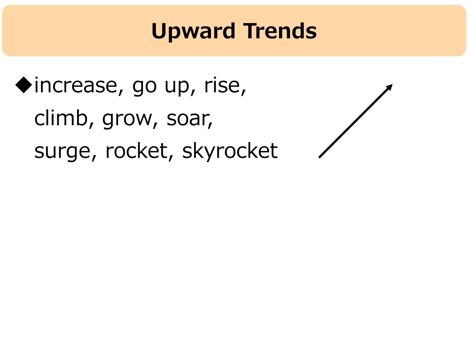

I’ve heard most of them, but I’m not familiar with “soar, surge, skyrocket.” What do they mean?
They are all used when something increases suddenly and hugely.
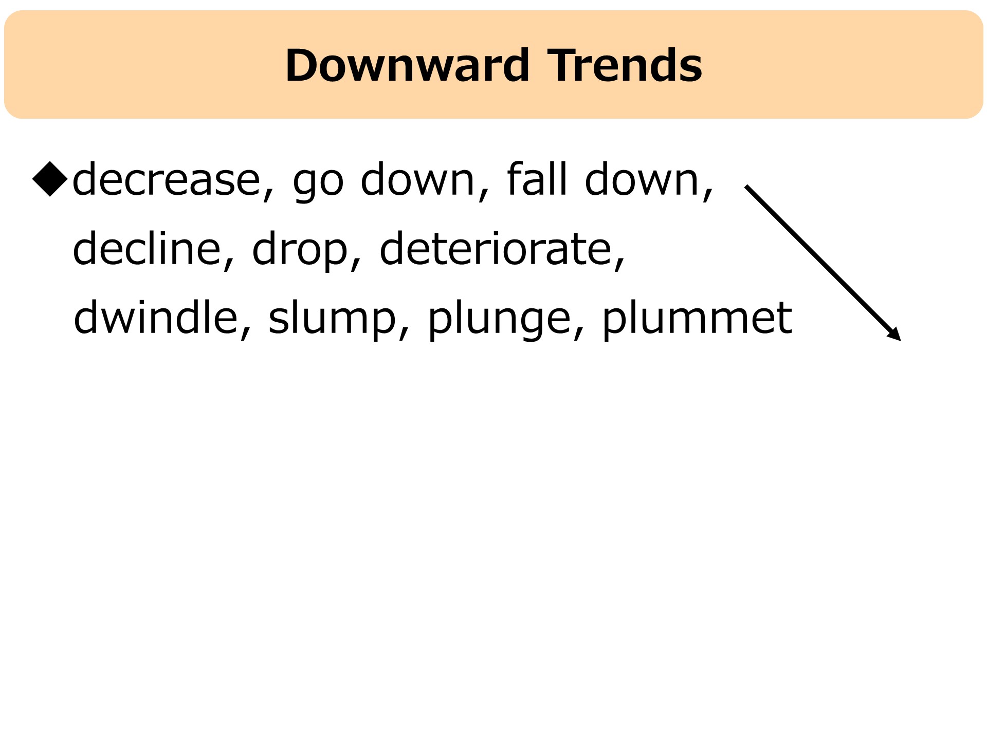
I guess “slump, plunge, plummet” mean a sudden decrease, right?
That’s right! There are more verbs and phrasal verbs for other types of changes in figures. Let’s take a look at these expressions.
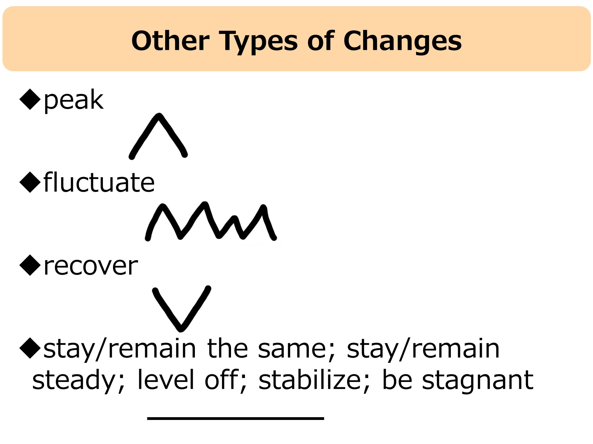
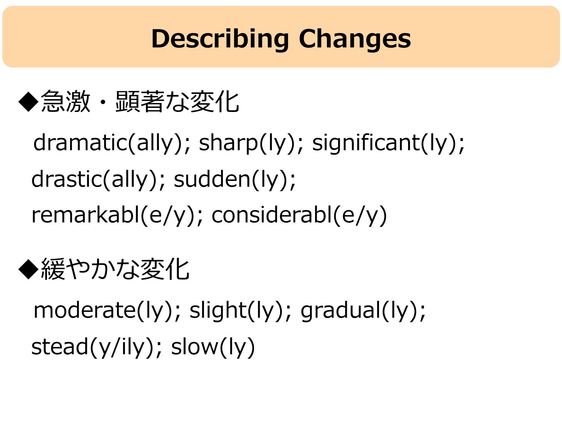
We have learned a variety of verbs and phrasal verbs to describe different kinds of changes in figures. They can be described more precisely by using adjectives and adverbs. Let’s go over these expressions.
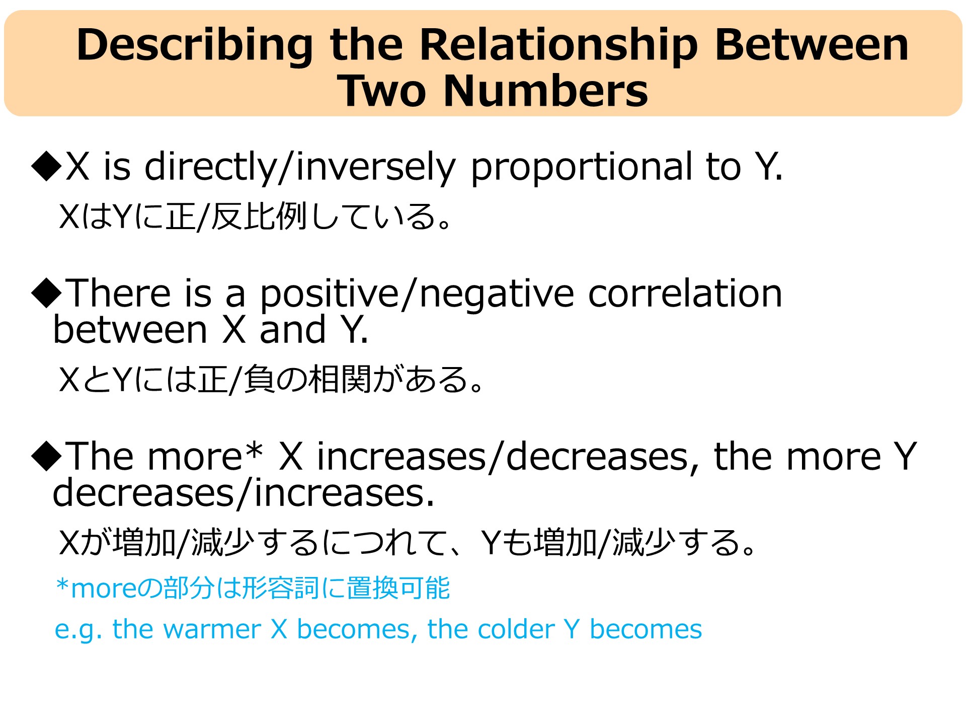
Now let us learn more about describing numbers for presentations. The following are for describing a relationship between two numbers.