1.2 Get to Know Different Kinds of Charts
(さまざまな種類の図表について知る)

Now you have learned why it is important to use graphs, charts and tables.

Yes. I’m planning to use a couple of charts in my lecture. But I’m not sure which ones I should use for my argument.
There are different kinds of graphs, and each has different characteristics. Now let’s find out how they differ.

That would be helpful.
1.2.1 Line Graphs
(線グラフ)

First, let me talk about line graphs.
A line graph consists of X (horizontal) axis and Y (vertical) axis. X axis usually indicates a time scale (i.e., seconds, minutes, hours). A line graph, therefore, illustrates how a set of data values, which is shown along Y axis, changes over time. You can also make a comparison between multiple sets of data by plotting several lines on the same line graph.
The line graph below shows the change in a global surface temperature relative to the average temperature of 1951-1980. As shown in the graph, the time scale indicated along X axis has to be divided into even intervals. Also, keep in mind that the scale of Y axis should not be too small as the patterns in the data could be exaggerated.
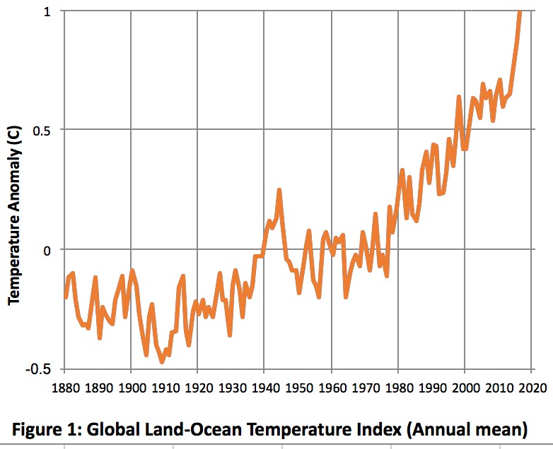
(Source: NASA)
https://climate.nasa.gov/vital-signs/global-temperature/
https://climate.nasa.gov/vital-signs/global-temperature/
Are you with me so far?

Yes. So I should use a line graph when I want to illustrate continuous data over a certain period of time. Are there any limitations on the number of lines I could use?
Good question. The maximum number of lines should be two. Your audience will miss your points if you use more lines.
Up to only two lines. I’ll remember that.